Unlocking the Mystery of "Angry Kirby": A Look at Nintendo's Localization Strategies

This article delves into the reasons behind Kirby's contrasting image in US and Japanese marketing, drawing on insights from former Nintendo employees. We explore Nintendo's approach to localization and its evolution over time.
A Tougher Kirby for Western Markets?
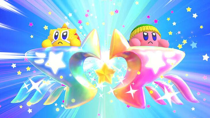
The "Angry Kirby" phenomenon, as fans dubbed it, involved a deliberate shift in the character's portrayal in Western markets. Former Nintendo Localization Director, Leslie Swan, clarified that the goal wasn't to depict anger, but rather to project determination, a trait perceived as more appealing to the US tween and teen boy demographic. This contrasts with the Japanese market, where Kirby's inherent cuteness is a major draw, as noted by Kirby: Triple Deluxe Director Shinya Kumazaki. While acknowledging the effectiveness of a "strong, battling" Kirby in the US, Kumazaki emphasized the continued dominance of cute Kirby in Japan.
Marketing Kirby: Beyond "Kiddie" Games

Nintendo's marketing strategy aimed to broaden Kirby's appeal, particularly among boys. The "Super Tuff Pink Puff" tagline for Kirby Super Star Ultra exemplifies this approach. Former Nintendo of America Public Relations Manager, Krysta Yang, highlighted Nintendo's desire to shed its "kiddie" image, a perception considered detrimental to sales. This led to a marketing focus on Kirby's combat abilities, aiming to attract a more mature audience. While recent marketing efforts have sought to present a more well-rounded Kirby, the "cute" perception persists.
Localization Choices: From Ghostly White to Determined Pink
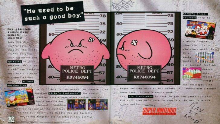
The divergence in Kirby's localization began early. The 1995 "Play It Loud" campaign's mugshot-style ad is a prime example. Subsequent game box art frequently showcased Kirby with sharper features and more intense expressions, seen in titles like Kirby: Nightmare in Dream Land, Kirby Air Ride, and Kirby: Squeak Squad. Even the original Kirby's Dreamland featured a ghostly-white Kirby on the US GameBoy release, a decision attributed to the console's monochrome display. This initial color difference, along with the perceived need to appeal to a broader audience, ultimately influenced the evolution of Kirby's image in Western box art.
A More Globalized Nintendo?
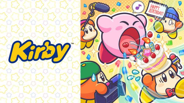
Both Swan and Yang concur that Nintendo has adopted a more globalized approach in recent years, fostering closer collaboration between its US and Japanese offices. This has resulted in greater consistency in marketing and localization strategies, minimizing regional variations like those seen in Kirby's earlier box art. While this fosters brand unity, Yang acknowledges potential drawbacks, such as a homogenization that could lead to less engaging, risk-averse marketing. The shift is also partly attributed to the increasing global awareness of Japanese culture and the blurring lines between regional tastes.
 Home
Home  Navigation


 Latest Articles




 Latest Games


![Chubby Story [v1.4.2] (Localizations)](https://imgs.xddxz.com/uploads/85/1719638042667f981a5e9f8.jpg)


![Zia – New Version 0.4 [Studio Zia]](https://imgs.xddxz.com/uploads/47/1719569268667e8b74e6004.jpg)


